Piggy: Native App Design
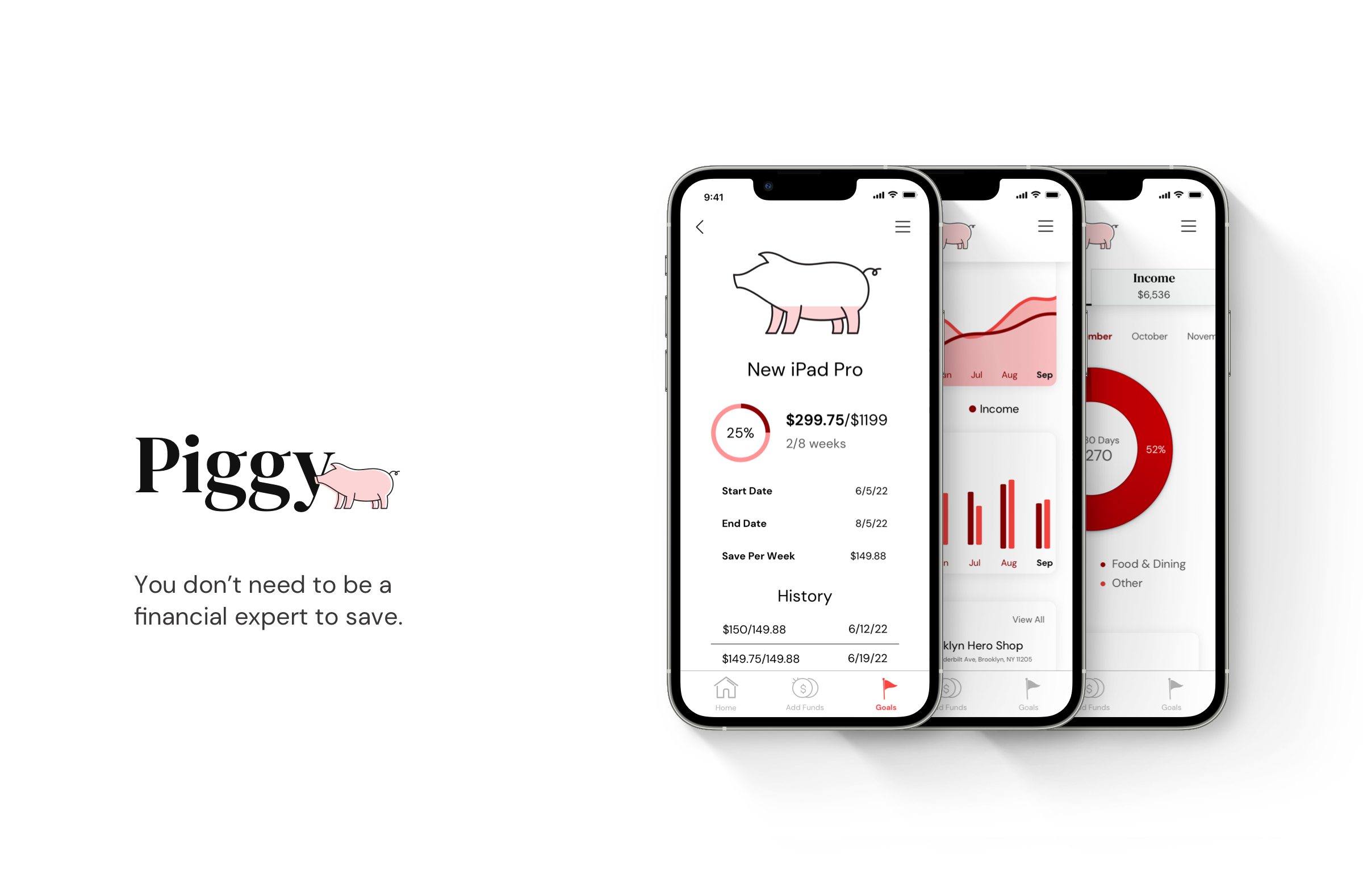
I created Piggy with the intent of marketing it as a financial advisor for people who are new to finances but motivated to save money for a particular goal. The challenge defining the brand guidelines for this project was figuring out how to strike a balance between seriousness (for reliability) and levity (for accessibility). The intended audience is people who do not like working with their finances, so it was important that the app not present as too complicated or intimidating. At the same time, it needed to promote trust and confidence, as users will be inputting personal and financial information.
The brand identity I defined is meant to reflect this duality. The logo and headings are DM Serif Display or DM Serif Text, communicating a sense of professionalism. The pig in the logo, the illustrations, and the DM Sans body text, however, make users feel like they can use this app even if they’re not financial experts. The somewhat silly name of the app itself, “Piggy,” is meant to reflect the idea of a piggy bank - a means of saving that even the least educated financier will know. The color scheme is largely monochromatic, centering around pink and magenta, which will give the app a distinct personality (and further reflect the idea of the app as a piggy bank of sorts).
My roles for this project included defining brand guidelines, constructing a user flow diagram, performing user testing, prototyping, creating the app’s visual design, and responsive design.
The Process
Brand
I started by defining a brand, including imagery, tone, and writing style.

Logo
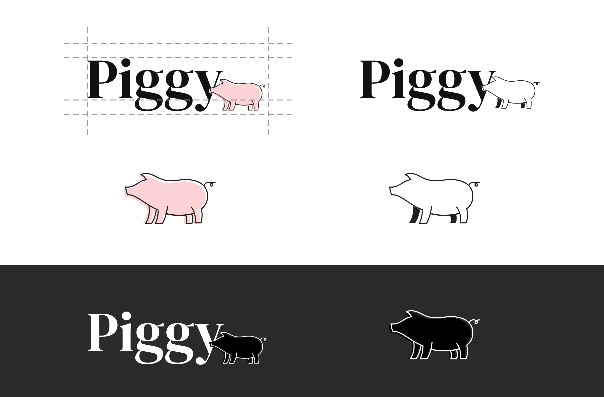
The app’s logo conveys seriousness and reliability through its use of a professional looking, serif font - DM Serif Display - while the pig also makes it feel fun and accessible. The brand name, Piggy, is meant to bring to mind the idea of a piggy bank, a means of saving that anyone might know and remember.
Competitive Analysis
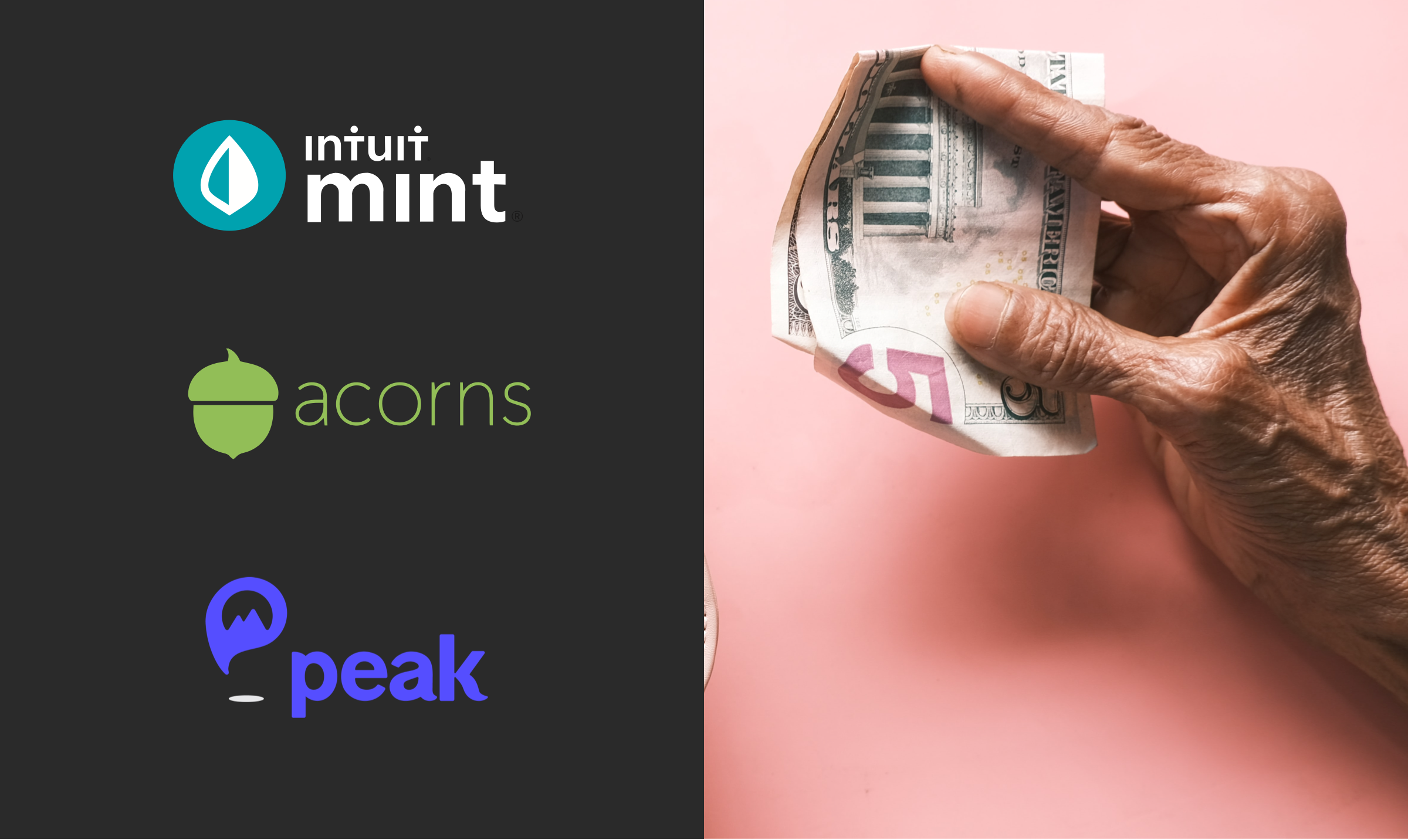
I studied 3 similar apps currently on the market to identify how they approached design patterns and various usability issues.
User Flow Diagram
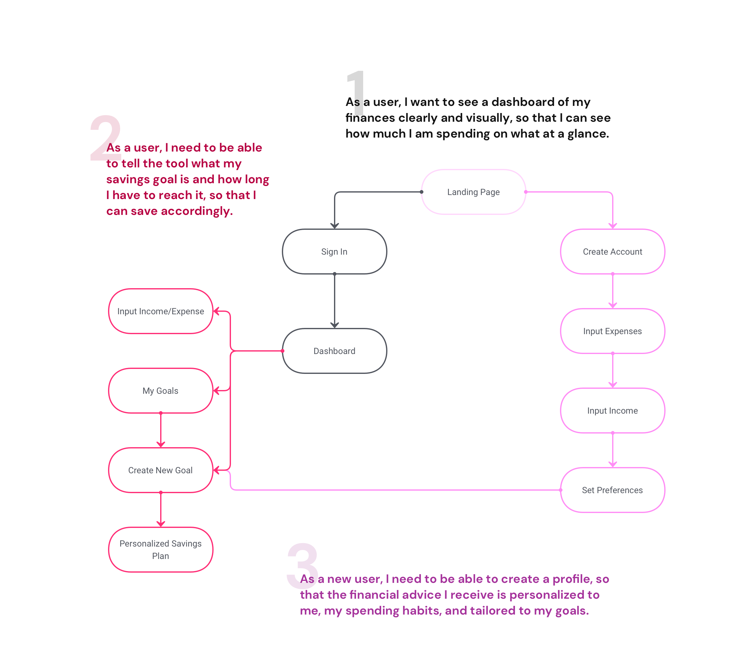
After studying similar apps, I considered what actions a user might take while navigating the app and created user flows for each. With the necessary screens mapped out, I knew which wireframes I needed to create to communicate these flows.
Prototyping, User Testing, and Wireframing
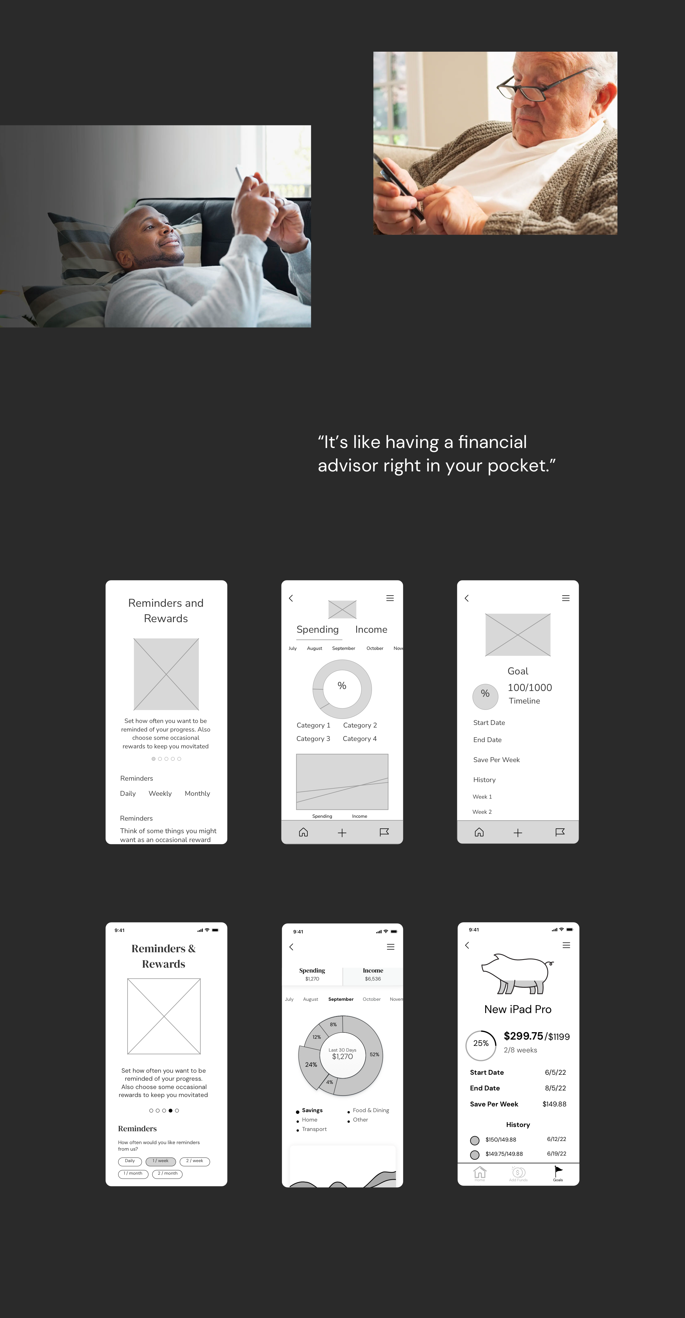
I created a series of wireframes based on the user flows and conducted user testing with an interactive prototype. After any usability issues had been addressed, these were developed into high-fidelity wireframes.
Visual Style
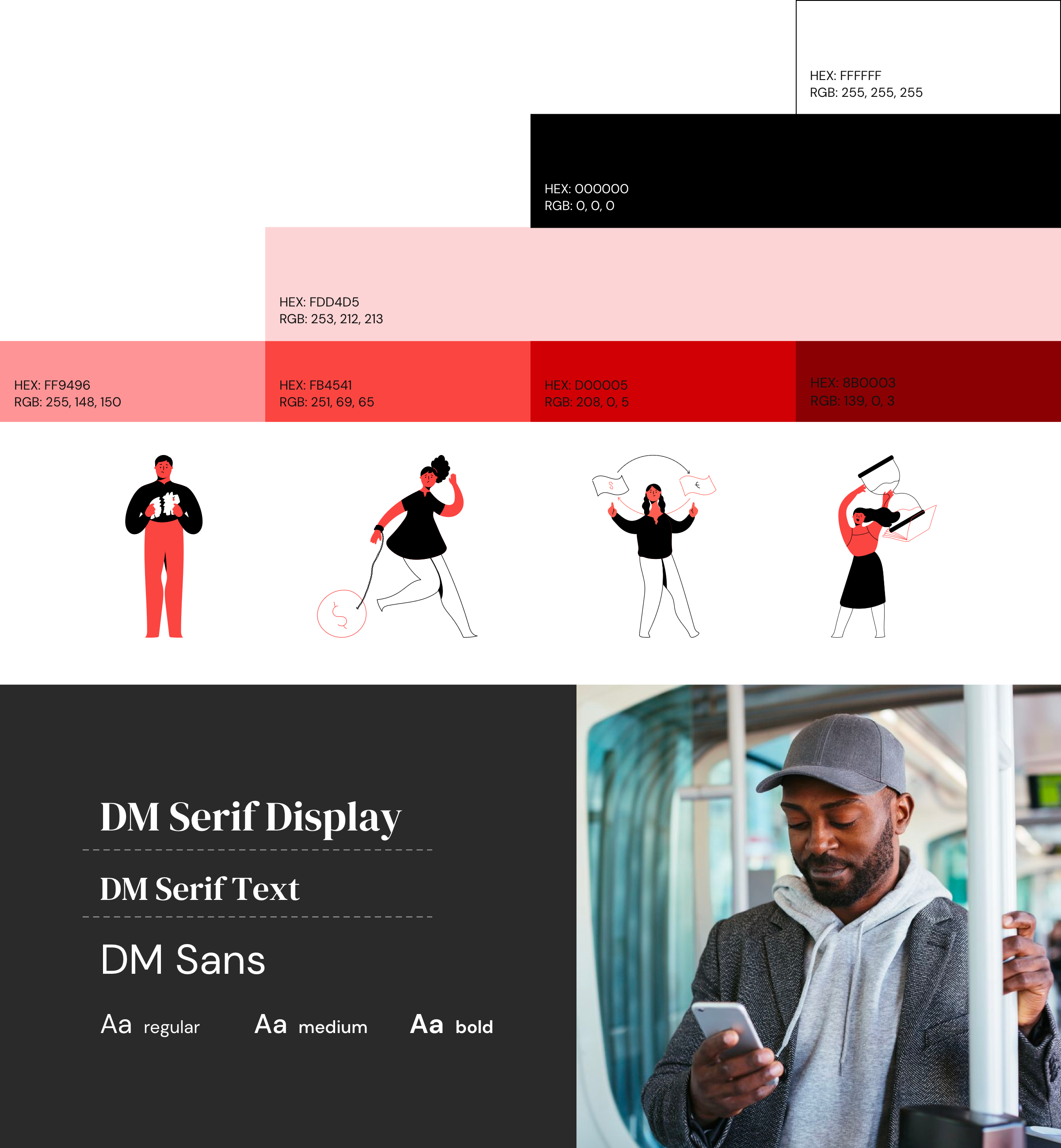
Next, I defined the visual style of the app with color, imagery, and typography. The monochromaticity of the color palette is meant to create a sense of professionalism and establish a distinct brand personality. The imagery is exclusively made up of “Baker Str Illustrations.” They lend personality to the brand and make the app more inviting to those who may be initially intimidated by finance. For the typeface, I used DM Serif Display and DM Serif Text for heading text and DM Sans for body text. Like the rest of the app, it is aimed at communicating reliability (Serif) as well as accessibility (Sans).
Pixel Perfect UI Design
With the visual style defined and implemented, I turned my wireframes into pixel perfect screens, ready to be sent to the development team.

Responsive Design
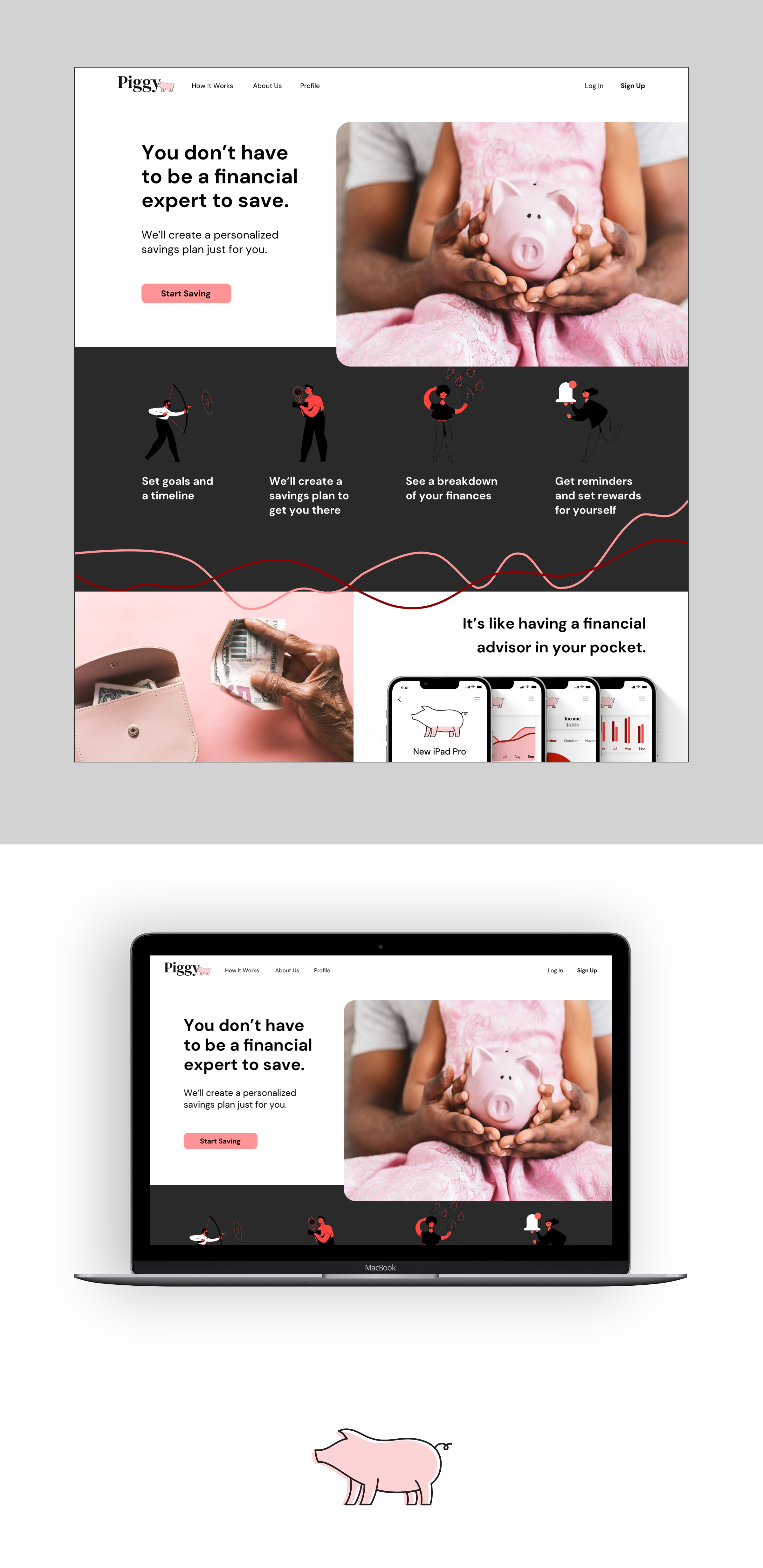
Lastly, I created a desktop design so the app could also be used at home.
